Designing and printing name cards may seem small, but it is a task that should not be overlooked. In fact, it can be quite tricky to design and print a professional-looking name card that represents your company and serves as a valuable marketing tool. As a digital name card printing agency, we are here to guide our customers in creating the perfect name card. When it comes to designing your name card, here are some pointers on what to do and what to stay away from.
What to Do?
• Prioritize Readability
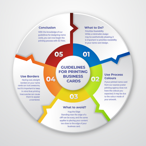
While a minimalist design may be aesthetically pleasing, it is important to prioritize readability in your name card design. This includes using a font size of at least 6 points and avoiding extremely thin or light fonts. Additionally, using clean lines with a minimum thickness of 0.25 pt and selecting colours wisely can ensure that your card is easily readable for potential customers.
• Use Process Colours
If your printed name card from our express poster printing agency does not have the colours you expected, it may be due to the colour mode of your artwork. When designing any artwork for printing, it’s important to use the appropriate colour mode, such as CMYK. The main colour mode for printing is CMYK, which is a subtractive model that uses Cyan, Magenta, Yellow, and Black to print against a white background. If your artwork is in a different colour mode, such as RGB, the colours may not appear as you intended.
What to avoid?
• Hug the Edge
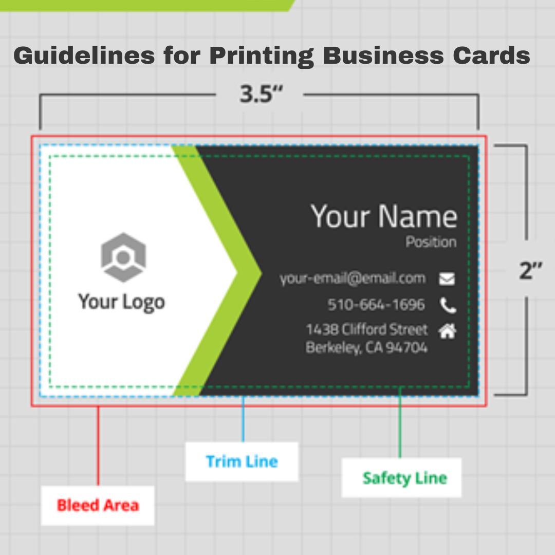
Standing near the edge of a cliff can be scary, and the same applies to placing your content too close to the edge of your business card. To ensure that your printed artwork is not cut off, it’s recommended to keep a 3mm margin from the edge. This is to account for any trimming inaccuracies that may occur between the bleed and the safety margin. Think of cutting/safety margins as “safety zones” to prevent important information from being accidentally cut off.
• Use Borders
Having cool, straight borders on your name cards can look awesome, but it’s important to keep in mind that printing inaccuracies can cause them to appear uncentered. While borders and frames on name cards are not prohibited, it’s important to be aware of the potential issues that can arise. Creativity is always encouraged, but it’s important to consider any potential liabilities that come with it.
Conclusion
With the knowledge of our guidelines for designing name cards, you can now begin the printing process with EZ Print. Keep in mind maintaining a professional appearance is crucial for effective name card design.


